Company
Comcast
Timeline
4 Weeks
Role
UX Designer
Skills
UX Research
Prototyping
User Interviewer
* All metrics, customer data, and numerical values shown in this case study have been modified or anonymized for confidentiality purposes while preserving the overall design context and workflow.
The in-house application team was tasked with improving the dispute review workflow, which relied on a Power Apps–based solution to centralize information from multiple internal systems.
However, platform limitations and incomplete external integrations still forced employees to switch between platforms and browsers while reviewing disputes, creating a fragmented experience that slowed efficiency.
How Might We…
bring clarity and structure to a fragmented workflow to reduce friction and help employees complete dispute reviews more efficiently?

Understanding the User
I interviewed users and conducted contextual research by observing multiple dispute review sessions and speaking directly with employees. This helped uncover key pain points and provided a clear understanding of the current workflow and its issues.
Pain Points
Weak information hierarchy pushes critical details below the fold, requiring unnecessary scrolling.
Inefficient navigation required users to scroll and click through content to complete a single review.
Lack of structured layout made information feel disconnected, making it harder to quickly understand related content.
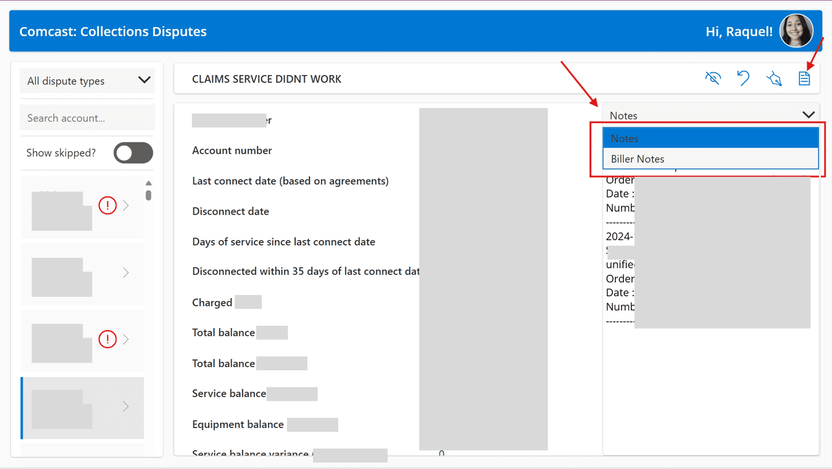
Hidden key information meant important details were not immediately visible and required additional clicks to access.
Exploration
Key Insights
01
Prioritize critical information so key details are immediately visible at the top of the page
02
Reduce navigation and scrolling by consolidating content into a single, scannable view
03
Surface essential context by default by displaying notes and status without requiring clicks
04
Group related information to create a more structured and easy-to-understand layout
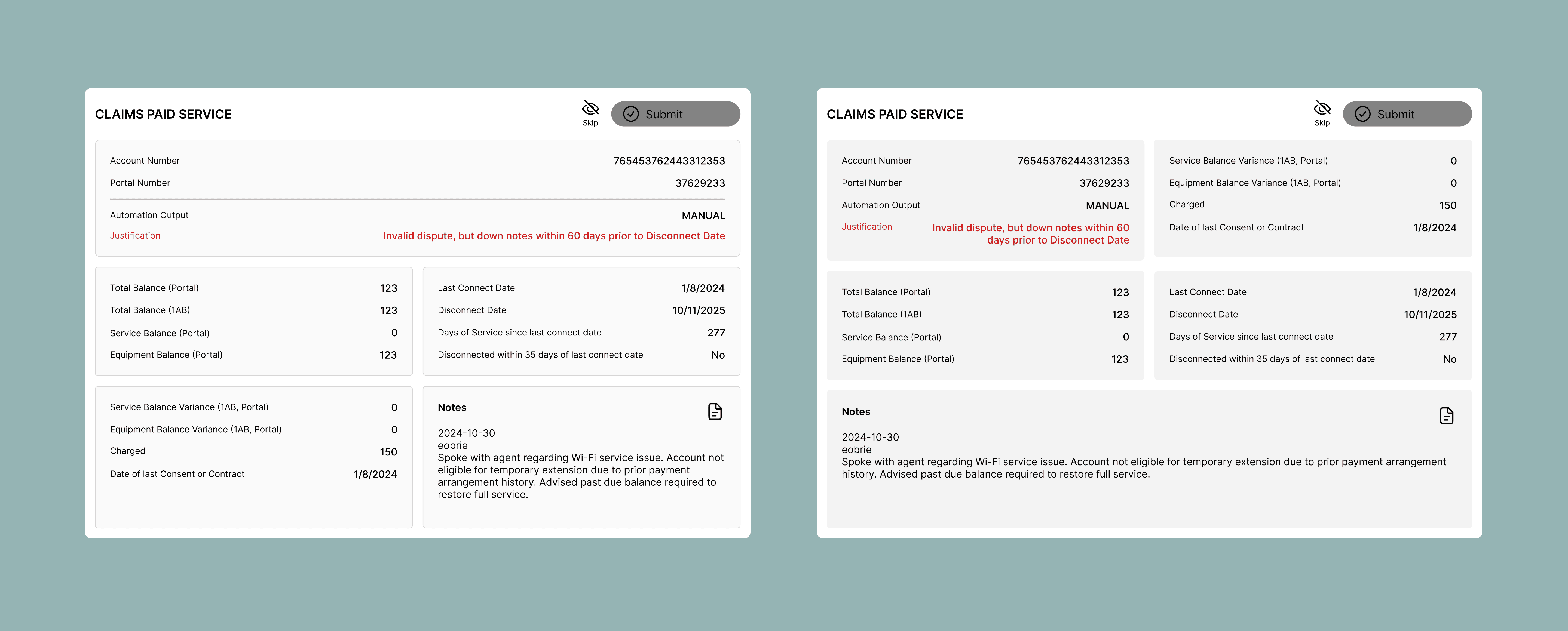
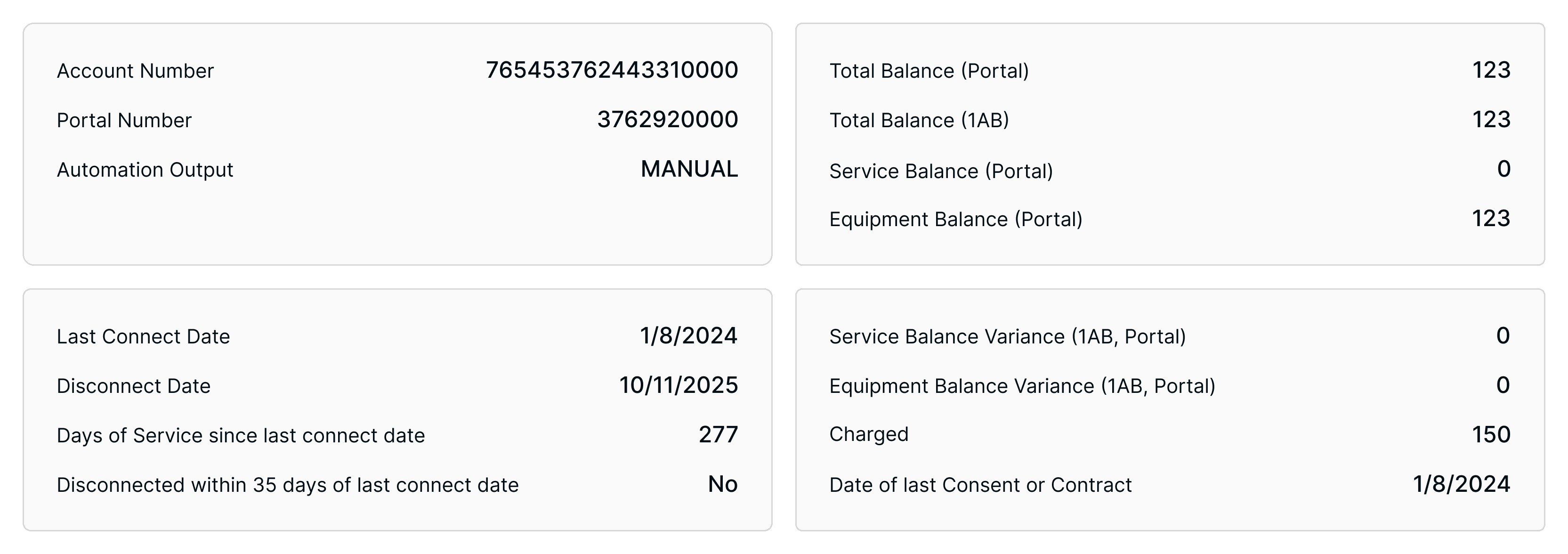
Condensed Layout Reduces Scrolling and Searching
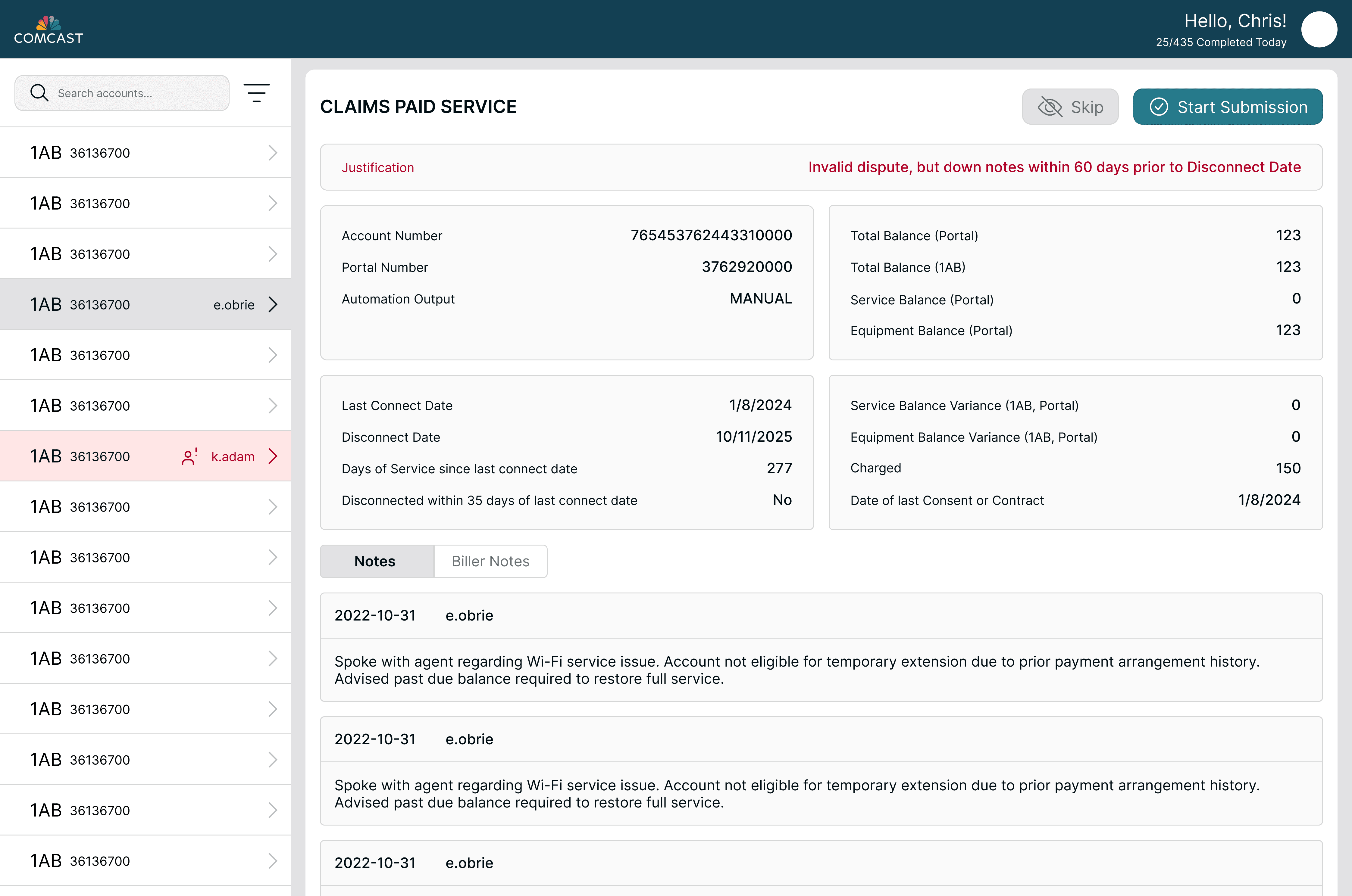
Grouped Layout Improves Scanability
Always-Visible Notes Reduce Friction
Notes and observations are always visible within the main view, eliminating the need to click into separate panels or modals. Separating notes into structured entries, rather than one long list, improves readability by making context and order easier to follow.

Prioritized and Color-Coded Key Information for Faster Evaluation

